
Date:
8 febrero, 2026
 Blog
Blog
[fusion_builder_container hundred_percent=”no” hundred_percent_height=”no” hundred_percent_height_scroll=”no” hundred_percent_height_center_content=”yes” equal_height_columns=”no” hide_on_mobile=”small-visibility,medium-visibility,large-visibility” background_color=”#ffffff” background_position=”center center” background_repeat=”no-repeat” fade=”no” background_parallax=”none” enable_mobile=”no” parallax_speed=”0.3″ video_aspect_ratio=”16:9″ video_loop=”yes” video_mute=”yes” border_style=”solid” type=”flex” padding_right=”80px” padding_left=”80px” flex_justify_content=”center” margin_top_small=”0px” margin_bottom_small=”0px” padding_top_small=”0px” padding_left_small=”25px” padding_right_small=”25px”][fusion_builder_row][fusion_builder_column type=”3_5″ layout=”1_1″ background_position=”left top” border_style=”solid” border_position=”all” background_repeat=”no-repeat” padding_top=”0px” padding_right=”0px” padding_bottom=”0px” padding_left=”0px” margin_top=”0px” margin_bottom=”0px” animation_speed=”0.3″ animation_direction=”left” hide_on_mobile=”small-visibility,medium-visibility,large-visibility” center_content=”no” last=”true” hover_type=”none” first=”true” spacing_left=”2%” spacing_right=”2%” spacing_left_small=”0px” spacing_right_small=”0px” margin_top_small=”0px” margin_bottom_small=”0px” padding_left_small=”0px” padding_bottom_small=”0px” padding_top_small=”0px” padding_right_small=”0px” type_small=”1_1″ background_blend_mode=”overlay” min_height=”” link=””][fusion_title title_type=”text” rotation_effect=”bounceIn” display_time=”1200″ highlight_effect=”circle” loop_animation=”off” highlight_width=”9″ highlight_top_margin=”0″ before_text=”” rotation_text=”” highlight_text=”” after_text=”” title_link=”off” link_url=”” link_target=”_self” hide_on_mobile=”small-visibility,medium-visibility,large-visibility” sticky_display=”normal,sticky” class=”” id=”” content_align_medium=”” content_align_small=”” content_align=”left” size=”1″ animated_font_size=”” fusion_font_family_title_font=”Montserrat” fusion_font_variant_title_font=”600″ font_size=”35″ line_height=”” letter_spacing=”” text_transform=”” text_color=”#000000″ hue=”” saturation=”” lightness=”” alpha=”” animated_text_color=”” text_shadow=”no” text_shadow_vertical=”” text_shadow_horizontal=”” text_shadow_blur=”0″ text_shadow_color=”” text_stroke=”no” text_stroke_size=”1″ text_stroke_color=”” text_overflow=”none” margin_top_medium=”” margin_right_medium=”” margin_bottom_medium=”” margin_left_medium=”” margin_top_small=”” margin_right_small=”” margin_bottom_small=”” margin_left_small=”” margin_top=”” margin_right=”” margin_bottom=”15px” margin_left=”” margin_top_mobile=”” margin_bottom_mobile=”” gradient_font=”no” gradient_start_color=”” gradient_end_color=”” gradient_start_position=”0″ gradient_end_position=”100″ gradient_type=”linear” radial_direction=”center center” linear_angle=”180″ highlight_color=”” style_type=”default” sep_color=”” link_color=”” link_hover_color=”” animation_type=”” animation_direction=”left” animation_color=”” animation_speed=”0.3″ animation_delay=”0″ animation_offset=””]
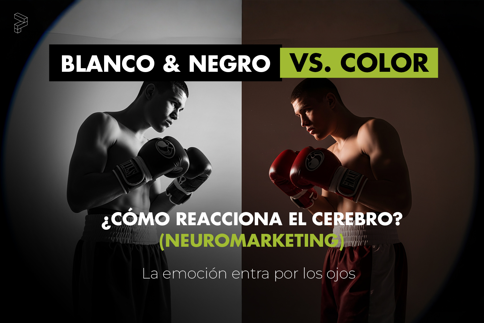
Blanco y negro vs color.
Cómo reacciona el cerebro (Neuromarketing)
[/fusion_title][fusion_text columns=”” column_min_width=”” column_spacing=”” rule_style=”” rule_size=”” rule_color=”” hue=”” saturation=”” lightness=”” alpha=”” fusion-dynamic-selection-tinymce=”” content_alignment_medium=”” content_alignment_small=”” content_alignment=”” hide_on_mobile=”large-visibility” sticky_display=”normal,sticky” class=”” id=”” margin_top=”” margin_right=”” margin_bottom=”” margin_left=”” fusion_font_family_text_font=”Montserrat” fusion_font_variant_text_font=”200″ font_size=”” line_height=”” letter_spacing=”” text_transform=”” text_color=”” animation_type=”” animation_direction=”left” animation_color=”” animation_speed=”0.3″ animation_delay=”0″ animation_offset=”” logics=””]

By Podium Strategy & Marketing
[/fusion_text][fusion_text columns=”” column_min_width=”” column_spacing=”” rule_style=”” rule_size=”” rule_color=”” hue=”” saturation=”” lightness=”” alpha=”” content_alignment_medium=”” content_alignment_small=”” content_alignment=”” hide_on_mobile=”small-visibility” sticky_display=”normal,sticky” class=”” id=”” margin_top=”” margin_right=”” margin_bottom=”” margin_left=”” fusion_font_family_text_font=”Montserrat” fusion_font_variant_text_font=”200″ font_size=”” line_height=”” letter_spacing=”” text_transform=”” text_color=”” animation_type=”” animation_direction=”left” animation_color=”” animation_speed=”0.3″ animation_delay=”0″ animation_offset=”” logics=””]
By Podium Strategy & Marketing
[/fusion_text][fusion_text columns=”” column_min_width=”” column_spacing=”” rule_style=”” rule_size=”” rule_color=”” hue=”” saturation=”” lightness=”” alpha=”” content_alignment_medium=”” content_alignment_small=”” content_alignment=”” hide_on_mobile=”small-visibility,medium-visibility,large-visibility” sticky_display=”normal,sticky” class=”” id=”” margin_top=”” margin_right=”” margin_bottom=”” margin_left=”” fusion_font_family_text_font=”Montserrat” fusion_font_variant_text_font=”200″ font_size=”” line_height=”” letter_spacing=”” text_transform=”” text_color=”” animation_type=”” animation_direction=”left” animation_color=”” animation_speed=”0.3″ animation_delay=”0″ animation_offset=”” logics=””]
En comunicación visual, el color no es una decisión estética: es una decisión cognitiva.
Elegir blanco y negro o color cambia cómo el cerebro procesa un mensaje, cómo se percibe una marca y qué tipo de respuesta genera.
[/fusion_text][fusion_text columns=”” column_min_width=”” column_spacing=”” rule_style=”” rule_size=”” rule_color=”” hue=”” saturation=”” lightness=”” alpha=”” content_alignment_medium=”” content_alignment_small=”” content_alignment=”” hide_on_mobile=”small-visibility,medium-visibility,large-visibility” sticky_display=”normal,sticky” class=”” id=”” margin_top=”” margin_right=”” margin_bottom=”” margin_left=”” fusion_font_family_text_font=”Montserrat” fusion_font_variant_text_font=”200″ font_size=”” line_height=”” letter_spacing=”” text_transform=”” text_color=”” animation_type=”” animation_direction=”left” animation_color=”” animation_speed=”0.3″ animation_delay=”0″ animation_offset=”” logics=””]
Desde el neuromarketing, ambos lenguajes activan zonas distintas del cerebro y cumplen funciones diferentes. Entender esto permite diseñar con intención, no por gusto.
[/fusion_text][fusion_title title_type=”text” rotation_effect=”bounceIn” display_time=”1200″ highlight_effect=”circle” loop_animation=”off” highlight_width=”9″ highlight_top_margin=”0″ before_text=”” rotation_text=”” highlight_text=”” after_text=”” title_link=”off” link_url=”” link_target=”_self” hide_on_mobile=”small-visibility,medium-visibility,large-visibility” sticky_display=”normal,sticky” class=”” id=”” content_align_medium=”” content_align_small=”” content_align=”left” size=”2″ animated_font_size=”” fusion_font_family_title_font=”Montserrat” fusion_font_variant_title_font=”600″ font_size=”35″ line_height=”” letter_spacing=”” text_transform=”” text_color=”#000000″ hue=”” saturation=”” lightness=”” alpha=”” animated_text_color=”” text_shadow=”no” text_shadow_vertical=”” text_shadow_horizontal=”” text_shadow_blur=”0″ text_shadow_color=”” text_stroke=”no” text_stroke_size=”1″ text_stroke_color=”” text_overflow=”none” margin_top_medium=”” margin_right_medium=”” margin_bottom_medium=”” margin_left_medium=”” margin_top_small=”” margin_right_small=”” margin_bottom_small=”” margin_left_small=”” margin_top=”50″ margin_right=”” margin_bottom=”40″ margin_left=”” margin_top_mobile=”” margin_bottom_mobile=”” gradient_font=”no” gradient_start_color=”” gradient_end_color=”” gradient_start_position=”0″ gradient_end_position=”100″ gradient_type=”linear” radial_direction=”center center” linear_angle=”180″ highlight_color=”” style_type=”default” sep_color=”” link_color=”” link_hover_color=”” animation_type=”” animation_direction=”left” animation_color=”” animation_speed=”0.3″ animation_delay=”0″ animation_offset=””]
¿Qué provoca el blanco y negro en el cerebro?
[/fusion_title][fusion_text columns=”” column_min_width=”” column_spacing=”” rule_style=”” rule_size=”” rule_color=”” hue=”” saturation=”” lightness=”” alpha=”” content_alignment_medium=”” content_alignment_small=”” content_alignment=”” hide_on_mobile=”small-visibility,medium-visibility,large-visibility” sticky_display=”normal,sticky” class=”” id=”” margin_top=”” margin_right=”” margin_bottom=”” margin_left=”” fusion_font_family_text_font=”Montserrat” fusion_font_variant_text_font=”200″ font_size=”” line_height=”” letter_spacing=”” text_transform=”” text_color=”” animation_type=”” animation_direction=”left” animation_color=”” animation_speed=”0.3″ animation_delay=”0″ animation_offset=”” logics=””]
El blanco y negro reduce estímulos visuales. Al eliminar el color, disminuye la carga sensorial y el cerebro entra en un modo más analítico, menos emocional inmediato.
En este contexto, se activa antes la memoria semántica —relacionada con conceptos, valores e ideas— que la memoria puramente emocional. El mensaje se procesa con más calma y profundidad.
Además, el blanco y negro genera una fuerte sensación de atemporalidad. No se percibe como algo pasajero o de tendencia, sino como algo pensado, con criterio.
Conclusión neurológica:
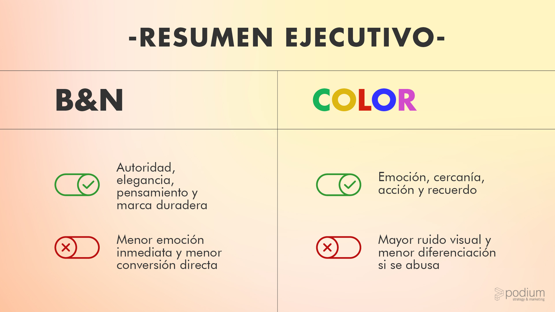
El blanco y negro invita a pensar más que a sentir
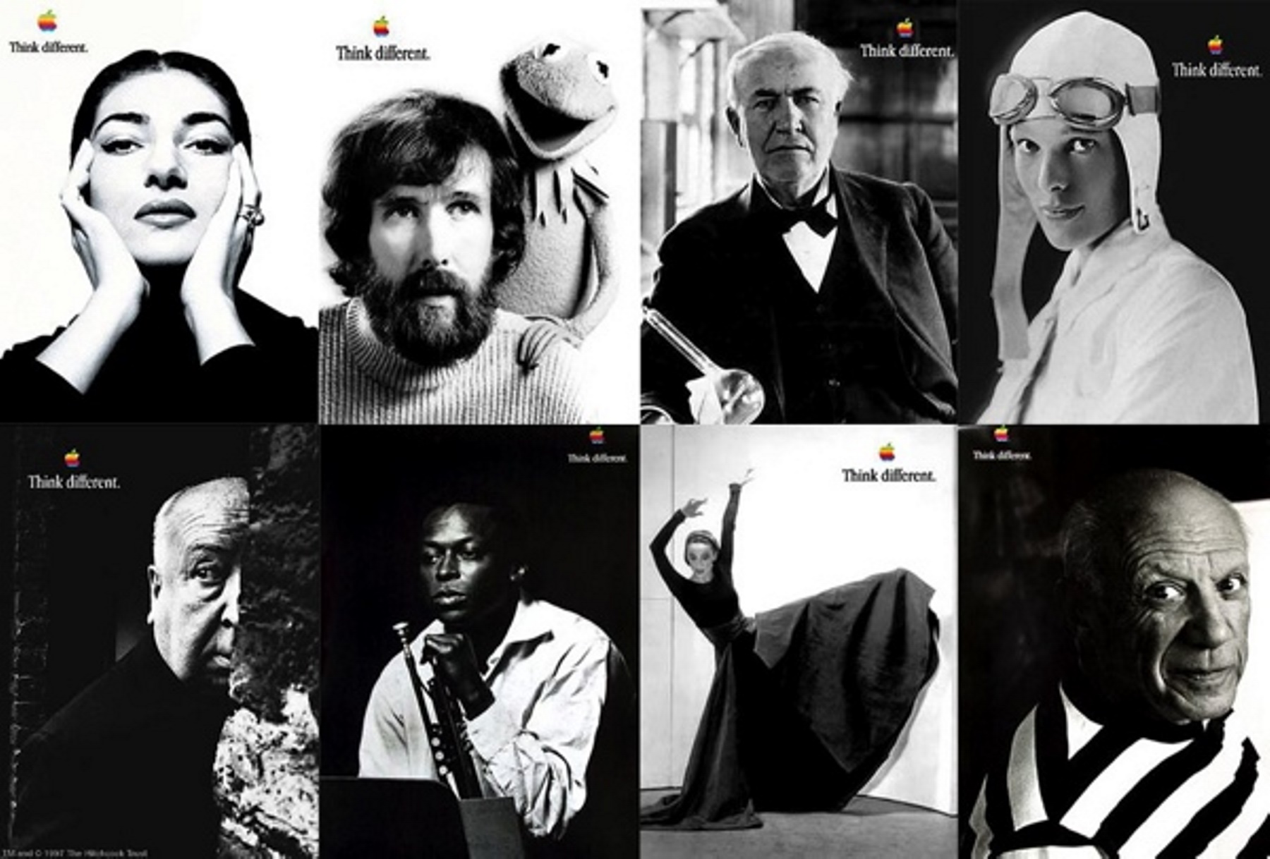
La campaña de Apple “Think Different” utilizó blanco y negro y es un ejemplo eliminar cualquier distracción visual y centrar la atención en las ideas, no en el producto.
Al prescindir del color, Apple se apropió del lenguaje de los íconos culturales y posicionó la marca como heredera del pensamiento que cambia el mundo.
[/fusion_text][fusion_title title_type=”text” rotation_effect=”bounceIn” display_time=”1200″ highlight_effect=”circle” loop_animation=”off” highlight_width=”9″ highlight_top_margin=”0″ before_text=”” rotation_text=”” highlight_text=”” after_text=”” title_link=”off” link_url=”” link_target=”_self” hide_on_mobile=”small-visibility,medium-visibility,large-visibility” sticky_display=”normal,sticky” class=”” id=”” content_align_medium=”” content_align_small=”” content_align=”left” size=”2″ animated_font_size=”” fusion_font_family_title_font=”Montserrat” fusion_font_variant_title_font=”600″ font_size=”35″ line_height=”” letter_spacing=”” text_transform=”” text_color=”#000000″ hue=”” saturation=”” lightness=”” alpha=”” animated_text_color=”” text_shadow=”no” text_shadow_vertical=”” text_shadow_horizontal=”” text_shadow_blur=”0″ text_shadow_color=”” text_stroke=”no” text_stroke_size=”1″ text_stroke_color=”” text_overflow=”none” margin_top_medium=”” margin_right_medium=”” margin_bottom_medium=”” margin_left_medium=”” margin_top_small=”” margin_right_small=”” margin_bottom_small=”” margin_left_small=”” margin_top=”50″ margin_right=”” margin_bottom=”40″ margin_left=”” margin_top_mobile=”” margin_bottom_mobile=”” gradient_font=”no” gradient_start_color=”” gradient_end_color=”” gradient_start_position=”0″ gradient_end_position=”100″ gradient_type=”linear” radial_direction=”center center” linear_angle=”180″ highlight_color=”” style_type=”default” sep_color=”” link_color=”” link_hover_color=”” animation_type=”” animation_direction=”left” animation_color=”” animation_speed=”0.3″ animation_delay=”0″ animation_offset=””]
Ventajas estratégicas del blanco y negro
[/fusion_title][fusion_text columns=”” column_min_width=”” column_spacing=”” rule_style=”” rule_size=”” rule_color=”” hue=”” saturation=”” lightness=”” alpha=”” content_alignment_medium=”” content_alignment_small=”” content_alignment=”” hide_on_mobile=”small-visibility,medium-visibility,large-visibility” sticky_display=”normal,sticky” class=”” id=”” margin_top=”50px” margin_right=”” margin_bottom=”” margin_left=”” fusion_font_family_text_font=”Montserrat” fusion_font_variant_text_font=”200″ font_size=”” line_height=”” letter_spacing=”” text_transform=”” text_color=”” animation_type=”” animation_direction=”left” animation_color=”” animation_speed=”0.3″ animation_delay=”0″ animation_offset=”” logics=””]
El blanco y negro está históricamente asociado al lujo, la autoría, la cultura, el diseño y la fotografía artística. Funciona especialmente bien en marcas que quieren proyectar una imagen reflexiva, elegante, segura de sí misma y poco comercial
Al reducir variables cromáticas, todo encaja mejor: web, presentaciones, redes sociales y piezas editoriales. Se minimizan errores visuales y se facilita la construcción de un lenguaje gráfico sólido y reconocible.
El blanco y negro elimina lo superfluo. El mensaje se percibe más serio, más honesto, más “verdadero”. Desde el neuromarketing, lo sobrio suele asociarse con credibilidad.
[/fusion_text][fusion_title title_type=”text” rotation_effect=”bounceIn” display_time=”1200″ highlight_effect=”circle” loop_animation=”off” highlight_width=”9″ highlight_top_margin=”0″ before_text=”” rotation_text=”” highlight_text=”” after_text=”” title_link=”off” link_url=”” link_target=”_self” hide_on_mobile=”small-visibility,medium-visibility,large-visibility” sticky_display=”normal,sticky” class=”” id=”” content_align_medium=”” content_align_small=”” content_align=”left” size=”2″ animated_font_size=”” fusion_font_family_title_font=”Montserrat” fusion_font_variant_title_font=”600″ font_size=”35″ line_height=”” letter_spacing=”” text_transform=”” text_color=”#000000″ hue=”” saturation=”” lightness=”” alpha=”” animated_text_color=”” text_shadow=”no” text_shadow_vertical=”” text_shadow_horizontal=”” text_shadow_blur=”0″ text_shadow_color=”” text_stroke=”no” text_stroke_size=”1″ text_stroke_color=”” text_overflow=”none” margin_top_medium=”” margin_right_medium=”” margin_bottom_medium=”” margin_left_medium=”” margin_top_small=”” margin_right_small=”” margin_bottom_small=”” margin_left_small=”” margin_top=”50″ margin_right=”” margin_bottom=”40″ margin_left=”” margin_top_mobile=”” margin_bottom_mobile=”” gradient_font=”no” gradient_start_color=”” gradient_end_color=”” gradient_start_position=”0″ gradient_end_position=”100″ gradient_type=”linear” radial_direction=”center center” linear_angle=”180″ highlight_color=”” style_type=”default” sep_color=”” link_color=”” link_hover_color=”” animation_type=”” animation_direction=”left” animation_color=”” animation_speed=”0.3″ animation_delay=”0″ animation_offset=””]
Contras reales del blanco y negro
[/fusion_title][fusion_text columns=”” column_min_width=”” column_spacing=”” rule_style=”” rule_size=”” rule_color=”” hue=”” saturation=”” lightness=”” alpha=”” content_alignment_medium=”” content_alignment_small=”” content_alignment=”” hide_on_mobile=”small-visibility,medium-visibility,large-visibility” sticky_display=”normal,sticky” class=”” id=”” margin_top=”” margin_right=”” margin_bottom=”” margin_left=”” fusion_font_family_text_font=”Montserrat” fusion_font_variant_text_font=”200″ font_size=”” line_height=”” letter_spacing=”” text_transform=”” text_color=”” animation_type=”” animation_direction=”left” animation_color=”” animation_speed=”0.3″ animation_delay=”0″ animation_offset=”” logics=””]
El color activa el sistema límbico, responsable de la emoción. El blanco y negro no dispara dopamina ni deseo rápido. Esto puede ser un problema para marcas que dependen del impulso, el consumo rápido, la emoción primaria o decisiones basadas en precio y energía.
Si no se acompaña de una narrativa humana, puede percibirse como demasiado serio o distante. En términos neurológicos, reduce la empatía inmediata si el tono no compensa la sobriedad visual.
Cuando todo es blanco y negro, nada destaca. Se pierde jerarquía emocional y el cerebro deja de encontrar puntos de activación. El error común es confundir sobriedad con monotonía.
[/fusion_text][fusion_title title_type=”text” rotation_effect=”bounceIn” display_time=”1200″ highlight_effect=”circle” loop_animation=”off” highlight_width=”9″ highlight_top_margin=”0″ before_text=”” rotation_text=”” highlight_text=”” after_text=”” title_link=”off” link_url=”” link_target=”_self” hide_on_mobile=”small-visibility,medium-visibility,large-visibility” sticky_display=”normal,sticky” class=”” id=”” content_align_medium=”” content_align_small=”” content_align=”left” size=”2″ animated_font_size=”” fusion_font_family_title_font=”Montserrat” fusion_font_variant_title_font=”600″ font_size=”35″ line_height=”” letter_spacing=”” text_transform=”” text_color=”#000000″ hue=”” saturation=”” lightness=”” alpha=”” animated_text_color=”” text_shadow=”no” text_shadow_vertical=”” text_shadow_horizontal=”” text_shadow_blur=”0″ text_shadow_color=”” text_stroke=”no” text_stroke_size=”1″ text_stroke_color=”” text_overflow=”none” margin_top_medium=”” margin_right_medium=”” margin_bottom_medium=”” margin_left_medium=”” margin_top_small=”” margin_right_small=”” margin_bottom_small=”” margin_left_small=”” margin_top=”50″ margin_right=”” margin_bottom=”40″ margin_left=”” margin_top_mobile=”” margin_bottom_mobile=”” gradient_font=”no” gradient_start_color=”” gradient_end_color=”” gradient_start_position=”0″ gradient_end_position=”100″ gradient_type=”linear” radial_direction=”center center” linear_angle=”180″ highlight_color=”” style_type=”default” sep_color=”” link_color=”” link_hover_color=”” animation_type=”” animation_direction=”left” animation_color=”” animation_speed=”0.3″ animation_delay=”0″ animation_offset=””]
¿Qué hace el color en el cerebro?
[/fusion_title][fusion_text columns=”” column_min_width=”” column_spacing=”” rule_style=”” rule_size=”” rule_color=”” hue=”” saturation=”” lightness=”” alpha=”” content_alignment_medium=”” content_alignment_small=”” content_alignment=”” hide_on_mobile=”small-visibility,medium-visibility,large-visibility” sticky_display=”normal,sticky” class=”” id=”” margin_top=”50px” margin_right=”” margin_bottom=”” margin_left=”” fusion_font_family_text_font=”Montserrat” fusion_font_variant_text_font=”200″ font_size=”” line_height=”” letter_spacing=”” text_transform=”” text_color=”” animation_type=”” animation_direction=”left” animation_color=”” animation_speed=”0.3″ animation_delay=”0″ animation_offset=”” logics=””]
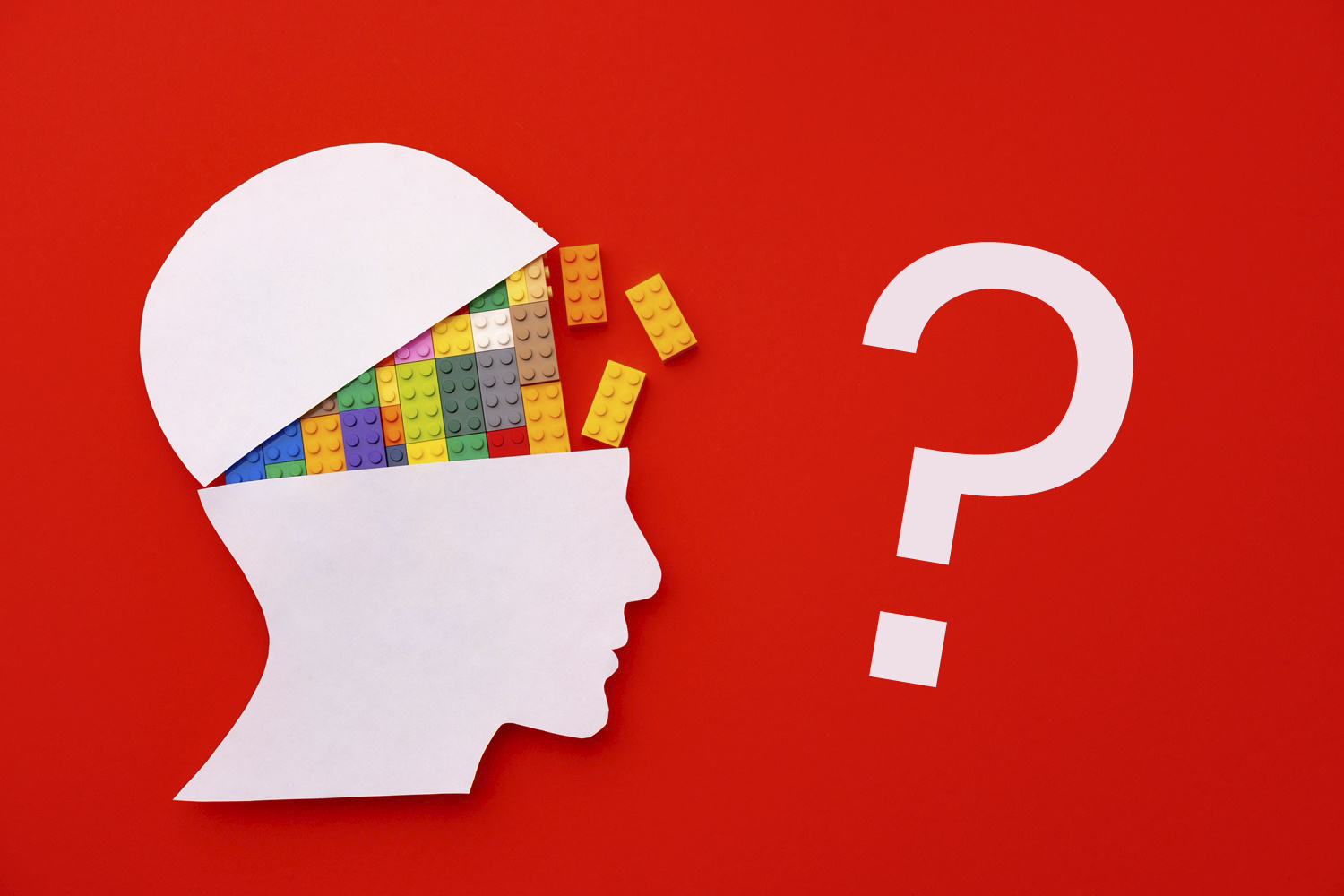
El color activa la emoción antes que la razón. Genera respuestas rápidas, casi instintivas, aumenta el recuerdo de marca y eleva la intención de acción.
En términos simples: el color vende más rápido.
[/fusion_text][fusion_title title_type=”text” rotation_effect=”bounceIn” display_time=”1200″ highlight_effect=”circle” loop_animation=”off” highlight_width=”9″ highlight_top_margin=”0″ before_text=”” rotation_text=”” highlight_text=”” after_text=”” title_link=”off” link_url=”” link_target=”_self” hide_on_mobile=”small-visibility,medium-visibility,large-visibility” sticky_display=”normal,sticky” class=”” id=”” content_align_medium=”” content_align_small=”” content_align=”left” size=”2″ animated_font_size=”” fusion_font_family_title_font=”Montserrat” fusion_font_variant_title_font=”600″ font_size=”35″ line_height=”” letter_spacing=”” text_transform=”” text_color=”#000000″ hue=”” saturation=”” lightness=”” alpha=”” animated_text_color=”” text_shadow=”no” text_shadow_vertical=”” text_shadow_horizontal=”” text_shadow_blur=”0″ text_shadow_color=”” text_stroke=”no” text_stroke_size=”1″ text_stroke_color=”” text_overflow=”none” margin_top_medium=”” margin_right_medium=”” margin_bottom_medium=”” margin_left_medium=”” margin_top_small=”” margin_right_small=”” margin_bottom_small=”” margin_left_small=”” margin_top=”50″ margin_right=”” margin_bottom=”40″ margin_left=”” margin_top_mobile=”” margin_bottom_mobile=”” gradient_font=”no” gradient_start_color=”” gradient_end_color=”” gradient_start_position=”0″ gradient_end_position=”100″ gradient_type=”linear” radial_direction=”center center” linear_angle=”180″ highlight_color=”” style_type=”default” sep_color=”” link_color=”” link_hover_color=”” animation_type=”” animation_direction=”left” animation_color=”” animation_speed=”0.3″ animation_delay=”0″ animation_offset=””]
Ventajas de usar color en comunicación visual
[/fusion_title][fusion_text columns=”” column_min_width=”” column_spacing=”” rule_style=”” rule_size=”” rule_color=”” hue=”” saturation=”” lightness=”” alpha=”” content_alignment_medium=”” content_alignment_small=”” content_alignment=”” hide_on_mobile=”small-visibility,medium-visibility,large-visibility” sticky_display=”normal,sticky” class=”” id=”” margin_top=”” margin_right=”” margin_bottom=”” margin_left=”” fusion_font_family_text_font=”Montserrat” fusion_font_variant_text_font=”200″ font_size=”” line_height=”” letter_spacing=”” text_transform=”” text_color=”” animation_type=”” animation_direction=”left” animation_color=”” animation_speed=”0.3″ animation_delay=”0″ animation_offset=”” logics=””]
El color humaniza, acerca y genera empatía. Facilita el famoso “me cae bien” antes incluso de entender el mensaje.
En entornos comerciales —webs, landings, folletos— el color suele generar más clics, más interacción y más acción. Es especialmente útil cuando hay competencia directa o cuando el producto necesita explicarse rápido.
Los colores funcionan como atajos cognitivos:
el azul transmite confianza, el verde sostenibilidad, el rojo energía o urgencia, y la combinación de negro con dorado sugiere lujo. El cerebro interpreta estos códigos sin esfuerzo consciente.

Coca-Cola siempre será un referente en el uso del color, con fuerte impacto emocional visual en spots y gráficas globales..
[/fusion_text][fusion_title title_type=”text” rotation_effect=”bounceIn” display_time=”1200″ highlight_effect=”circle” loop_animation=”off” highlight_width=”9″ highlight_top_margin=”0″ before_text=”” rotation_text=”” highlight_text=”” after_text=”” title_link=”off” link_url=”” link_target=”_self” hide_on_mobile=”small-visibility,medium-visibility,large-visibility” sticky_display=”normal,sticky” class=”” id=”” content_align_medium=”” content_align_small=”” content_align=”left” size=”2″ animated_font_size=”” fusion_font_family_title_font=”Montserrat” fusion_font_variant_title_font=”600″ font_size=”35″ line_height=”” letter_spacing=”” text_transform=”” text_color=”#000000″ hue=”” saturation=”” lightness=”” alpha=”” animated_text_color=”” text_shadow=”no” text_shadow_vertical=”” text_shadow_horizontal=”” text_shadow_blur=”0″ text_shadow_color=”” text_stroke=”no” text_stroke_size=”1″ text_stroke_color=”” text_overflow=”none” margin_top_medium=”” margin_right_medium=”” margin_bottom_medium=”” margin_left_medium=”” margin_top_small=”” margin_right_small=”” margin_bottom_small=”” margin_left_small=”” margin_top=”50″ margin_right=”” margin_bottom=”40″ margin_left=”” margin_top_mobile=”” margin_bottom_mobile=”” gradient_font=”no” gradient_start_color=”” gradient_end_color=”” gradient_start_position=”0″ gradient_end_position=”100″ gradient_type=”linear” radial_direction=”center center” linear_angle=”180″ highlight_color=”” style_type=”default” sep_color=”” link_color=”” link_hover_color=”” animation_type=”” animation_direction=”left” animation_color=”” animation_speed=”0.3″ animation_delay=”0″ animation_offset=””]
Contras del color
[/fusion_title][fusion_text columns=”” column_min_width=”” column_spacing=”” rule_style=”” rule_size=”” rule_color=”” hue=”” saturation=”” lightness=”” alpha=”” content_alignment_medium=”” content_alignment_small=”” content_alignment=”” hide_on_mobile=”small-visibility,medium-visibility,large-visibility” sticky_display=”normal,sticky” class=”” id=”” margin_top=”” margin_right=”” margin_bottom=”60″ margin_left=”” fusion_font_family_text_font=”Montserrat” fusion_font_variant_text_font=”200″ font_size=”” line_height=”” letter_spacing=”” text_transform=”” text_color=”” animation_type=”” animation_direction=”left” animation_color=”” animation_speed=”0.3″ animation_delay=”0″ animation_offset=”” logics=””]
Más estímulos implican menos foco. El riesgo es parecer comercial, genérico o poco diferenciado si no hay un criterio claro.
Los colores pasan de moda. Lo que hoy se percibe moderno mañana puede envejecer. El blanco y negro, en cambio, tiende a mantenerse vigente en el tiempo.
[/fusion_text][fusion_text columns=”” column_min_width=”” column_spacing=”” rule_style=”” rule_size=”” rule_color=”” hue=”” saturation=”” lightness=”” alpha=”” content_alignment_medium=”” content_alignment_small=”” content_alignment=”” hide_on_mobile=”small-visibility,medium-visibility,large-visibility” sticky_display=”normal,sticky” class=”” id=”” margin_top=”” margin_right=”” margin_bottom=”” margin_left=”” fusion_font_family_text_font=”Montserrat” fusion_font_variant_text_font=”200″ font_size=”” line_height=”” letter_spacing=”” text_transform=”” text_color=”” animation_type=”” animation_direction=”left” animation_color=”” animation_speed=”0.3″ animation_delay=”0″ animation_offset=”” logics=””]
La decisión correcta: el sistema híbrido
[/fusion_text][fusion_text columns=”” column_min_width=”” column_spacing=”” rule_style=”” rule_size=”” rule_color=”” hue=”” saturation=”” lightness=”” alpha=”” content_alignment_medium=”” content_alignment_small=”” content_alignment=”” hide_on_mobile=”small-visibility,medium-visibility,large-visibility” sticky_display=”normal,sticky” class=”” id=”” margin_top=”” margin_right=”” margin_bottom=”60″ margin_left=”” fusion_font_family_text_font=”Montserrat” fusion_font_variant_text_font=”200″ font_size=”” line_height=”” letter_spacing=”” text_transform=”” text_color=”” animation_type=”” animation_direction=”left” animation_color=”” animation_speed=”0.3″ animation_delay=”0″ animation_offset=”” logics=””]
Las marcas maduras no eligen blanco y negro o color. Eligen un sistema visual híbrido.
Una estrategia eficaz suele partir de una identidad base sobria —logo, tipografía, arquitectura visual y fotografía editorial en blanco y negro— y utilizar el color como acento estratégico: llamadas a la acción, detalles clave, campañas puntuales o elementos humanos como personas y producto.
Desde el neuromarketing, esta combinación permite mantener el control racional del mensaje y activar la emoción solo cuando es necesario.
[/fusion_text][fusion_text columns=”” column_min_width=”” column_spacing=”” rule_style=”” rule_size=”” rule_color=”” hue=”” saturation=”” lightness=”” alpha=”” content_alignment_medium=”” content_alignment_small=”” content_alignment=”” hide_on_mobile=”small-visibility,medium-visibility,large-visibility” sticky_display=”normal,sticky” class=”” id=”” margin_top=”60″ margin_right=”” margin_bottom=”60″ margin_left=”” fusion_font_family_text_font=”” fusion_font_variant_text_font=”” font_size=”” line_height=”” letter_spacing=”” text_transform=”” text_color=”” animation_type=”” animation_direction=”left” animation_color=”” animation_speed=”0.3″ animation_delay=”0″ animation_offset=”” logics=””]
[/fusion_text][/fusion_builder_column][/fusion_builder_row][/fusion_builder_container]